Below is my final product of my advert, I have looked at all the feedback and adapted some parts, I feel that the advert is eye catching as well as relating well to the music video and the genre.
I used the colours and fonts that I did as I spent a fair amount of time researching and testing the colours and fonts and found that the red and beige colours worked well on the black background and really stood out.
I have completed my CD cover, using a multiple range of fonts a colours, this is to catch the audiences eye, I researched thoroughly online for inspiration about the colours and fonts that other pop punk bands use and created a font test which will be shown below.
I used the colours red and black on the CD cover, this is because they are bold and eye catching colours, I used a font called ‘Verdana’ and another called ‘forte’ as they are bold fonts. The images I used are eye catching.
On the spines, I have used the colour purple as this stands out a lot from the other colours making it eye catching, I have put ‘Secrets’ on the main spine, and the other purple writing is the CD number.
This is our final cut of ‘Secrets’ by state Champs
We tweaked our video from our first cut to what is shown here, we have changed some effects to relate to our genre better, we have also made the lip syncing more accurate and the final thing we did was make the cuts between the narrative and band shots less obvious, this is to help the video flow more without sharp interruptions and changes on screen.
We’re almost there. Here is the first edit of our music video ‘Secrets’ by State Champs. Unfortunately the sound was set too high of Final Cut Pro hence the distortion, this will be fixed for the final cut. A major change that will be made is the filters on each shot, narrative will have a red hazy filter whilst the band shots will have a steel blue filter to clearly distinguish the difference. Must watch in 1080p.
We need to make some tweaks, mainly to match up the lip syncing as accurately as possible, we also need to make the cuts between shots smoother and more subtle, another thing that we can improve on is trying to crop out some of the unwanted background at the edge of the screen such as the radiators and parts of curtain to make it look more professional.
We decided to change the band members, this was because we felt our drummer wasn’t enthusiastic enough and we decided to use Fraser instead as he showed more of the characteristics that were needed for our genre. Another alteration we made was using less narrative than planned, this was decided before we started filming, as we felt we could cover the narrative in much less time and therefore use more time to show lip and band syncing as well as the band shots which are more related to pop punk . We also changed our location from the ogstoun theatre to the ATC huts as we felt the ATC huts suited our genre more as it gave more of a ‘garage’ feel.
The silent walk – A path on the grounds, we do not need permission to use the premises, we have selected this area because it is a good area to film long shots, it also has an edgy feel to it, whilst representing a happy theme.
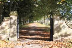
The north gate – We do not need permission to film in this area, we have chosen to film in this strip, as it creates an extreme long shot, which will be very useful for the scene where the boyfriend sneaks out to meet another girl, as it will show the different timings whilst he walks into the distance, the gate creates an edgy effect which relates well with our genre Pop Punk.
The ATC huts – We gained permission to use the ATC huts to film the band shots, the set in the room relates well with the ideas of the band and links well with the genre, the room gives off a atmosphere much like a garage, which relates well to the genre as pop punk bands often rehearse in a place like a garage.